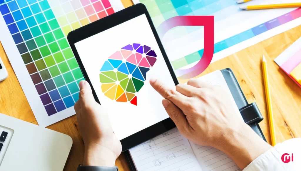
Color psychology plays a crucial role in UI design, influencing users’ emotions, perceptions, and behaviors within a digital interface. Understanding how colors evoke specific feelings and applying this knowledge strategically can create engaging and intuitive user experiences. Each color carries emotional and psychological associations, impacting how users feel and interact with digital products.
The use of color in UI/UX design goes beyond aesthetics. It shapes how users experience and navigate through a website or app. The right color palette can build trust, guide decisions, and make experiences memorable. Partnering with the right UI/UX design company is essential to leverage color psychology effectively in your project.
Color psychology in UI design utilizes specific colors to evoke emotions and guide user behavior. Colors like red for urgency and blue for trust are commonly used to influence user perceptions and drive desired actions. By incorporating color psychology in UI design, designers can create unique brand identities, enhance user experience, and evoke specific emotional responses.
Colors have psychological impacts, triggering subconscious responses in individuals. Warm colors like red and orange can energize people, while cool tones like green and blue foster calmness. Colors also communicate meaning, with red signifying urgency or danger, for example. Understanding the psychological associations of colors can help designers create user-centered designs for optimal user experiences.
Implementing color psychology in UI design involves following best practices to ensure effectiveness. These practices include aligning colors with brand guidelines, maintaining consistency, using the 60-30-10 rule for color distribution, employing contrast for readability, considering cultural differences, and conducting A/B testing for optimal results. By following these best practices, designers can create engaging and user-friendly interfaces that resonate with users on an emotional level.
Real-world examples of companies successfully implementing color psychology in UI design include CollabCRM, Stripe, McDonald’s, Netflix, Spotify, Apple, and Slack. These companies use color palettes strategically to convey brand identity, evoke specific emotions, and enhance user experience. By leveraging color psychology effectively, these companies stand out from their competitors and create engaging digital experiences for their users.
From color theory to business growth, choosing the right UI/UX design partner is crucial for impactful design solutions. By partnering with a team of experienced UI/UX designers, businesses can create visually appealing and user-friendly interfaces that drive engagement, conversions, and profitability. Whether designing a website, mobile app, or software product, incorporating color psychology in UI design is essential for creating memorable and engaging user experiences.

